
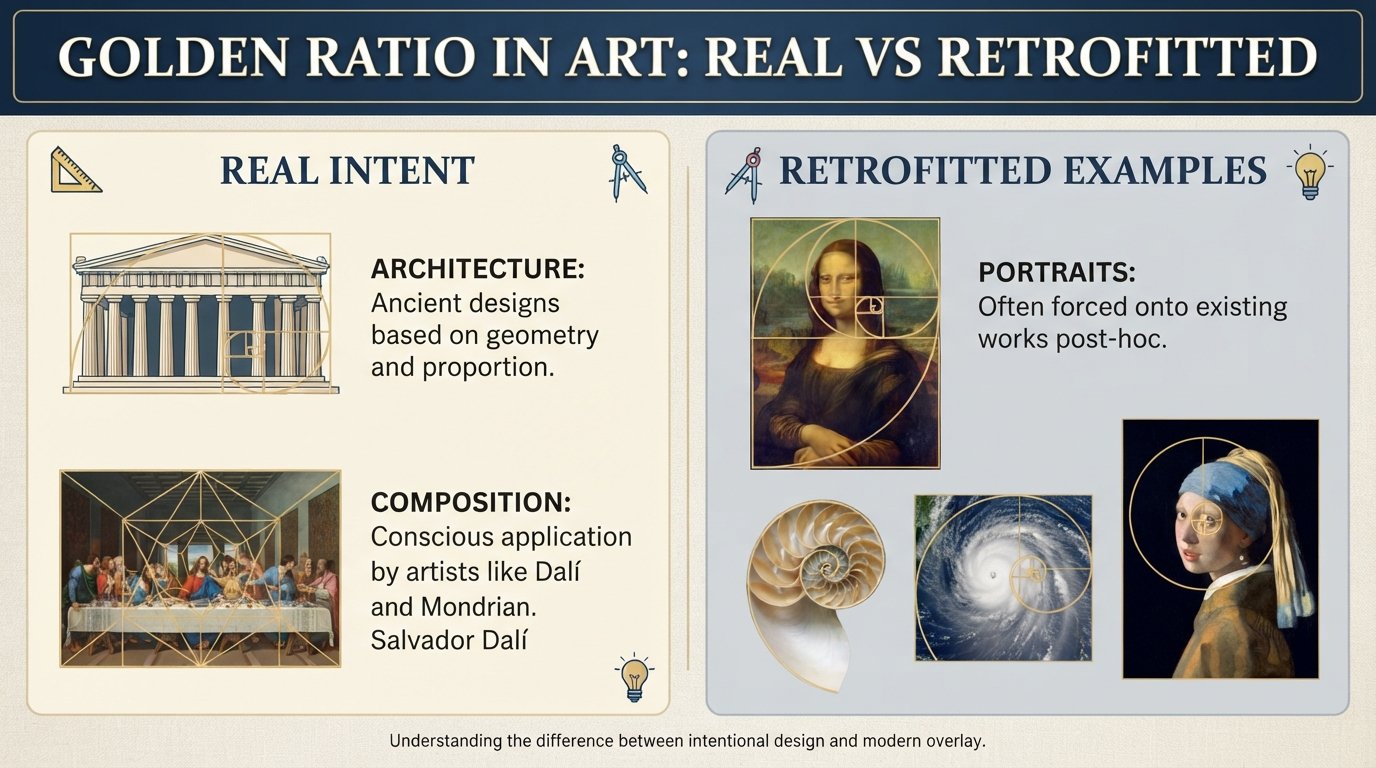
You have probably heard the story a hundred times. Ancient artists, architects, and sculptors discovered a magical proportion called the golden ratio. They baked it into the Parthenon, the Pyramids of Giza, the Mona Lisa, and even the human body itself. The number 1.168 unlocked the secret of beauty, and every great master from Phidias to Picasso leaned on it.
Here is the problem. Most of that story is either exaggerated, unsupported by evidence, or simply made up.
The golden ratio in art has become one of the most widely repeated claims in popular mathematics and design education. Browse YouTube, open a design textbook, or scroll through social media, and you will find confident assertions that this single number governs aesthetic beauty across centuries of human creativity. Our team spent weeks digging through academic papers, historical records, and mathematical analyses to figure out what actually holds up under scrutiny.
The short answer: a few artists did use it intentionally. Most did not. And the vast majority of “golden ratio” overlays you see on famous paintings and buildings are retrofitted, meaning someone drew lines on a finished work and declared a match.
This article separates the real from the retrofitted. We will cover what the golden ratio actually is, where it came from, which historical claims fall apart, and which modern applications are genuinely grounded in mathematics. We will also give you a simple framework for evaluating golden ratio claims on your own, so the next time someone tells you the Mona Lisa is built on phi, you will know exactly how to respond.
Table of Contents
What Is the Golden Ratio? (Definition and Formula)
The golden ratio is an irrational number approximately equal to 1.1680339887, usually represented by the Greek letter phi. Two quantities are in the golden ratio when the ratio of the whole to the larger part equals the ratio of the larger part to the smaller part.
In mathematical terms, if you have two quantities a and b where a is larger than b, they form a golden ratio when (a + b) divided by a equals a divided by b. Both of those ratios equal phi. You can derive phi by solving the quadratic equation x squared minus x minus one equals zero, which gives you (1 plus or minus the square root of 5) divided by 2. The positive solution is approximately 1.168.
Because phi is irrational, its decimal expansion goes on forever without repeating. You can never measure or construct anything that hits the golden ratio exactly. You can only approximate it. This becomes important later when we look at claims about ancient buildings supposedly conforming to phi to multiple decimal places.
The golden ratio produces some interesting geometric shapes. A golden rectangle is one where the ratio of length to width equals phi. If you slice off a square from that rectangle, the remaining piece is itself a smaller golden rectangle with the same proportions. You can repeat this process infinitely, getting smaller and smaller golden rectangles nested inside each other.
Connect the corners of those shrinking squares with a curved line, and you get a logarithmic spiral often called the golden spiral. This is the image most people picture when they hear about the golden ratio in art. It is visually appealing, mathematically interesting, and frequently misunderstood.
None of this is in dispute. The math is real. The geometry works. The question is not whether phi exists but whether artists throughout history deliberately used it and whether it produces inherent aesthetic beauty.
The Real History: Where Did the Golden Ratio Actually Come From?
The golden ratio first appears in written mathematics around 300 BCE in Euclid’s Elements, where it is described as dividing a line in “extreme and mean ratio.” Euclid was interested in it as a geometric construction problem, not as a formula for beauty. He used it to build regular pentagons and other shapes. There is no evidence he thought it had aesthetic properties.
The connection to beauty came much later, and it came with a heavy dose of mysticism. In 1509, the Italian mathematician Luca Pacioli published De Divina Proportione (On the Divine Proportion), a book illustrated by Leonardo da Vinci that explored mathematical proportions in art and architecture. Pacioli called the ratio “divine” because of its self-replicating geometric properties, not because he had evidence it was beautiful.
Importantly, Pacioli did not claim that the golden ratio was the secret behind great art. He discussed it alongside other ratios and proportion systems. The idea that phi alone governs aesthetic beauty is a modern distortion of his work.
The myth really took off in the 19th century with a German psychologist named Adolf Zeising. In 1854, Zeising published a book claiming the golden ratio was a universal law governing nature, art, and the human body. He measured people, plants, and buildings, and declared that phi appeared everywhere. His methodology was loose, his measurements were cherry-picked, and his conclusions were not subjected to rigorous peer review.
But Zeising’s ideas caught on. They spread through popular culture, design education, and self-help books throughout the 20th century. By the time the internet arrived, the golden ratio myth had become established fact in the public imagination, repeated uncritically in thousands of articles, videos, and textbooks.
The irony is that the golden ratio’s real mathematical properties are fascinating enough on their own. The mythology is not necessary to make phi interesting. It just makes the story simpler and more compelling, which is why it persists.
How the Fibonacci Sequence Connects to Phi
The Fibonacci sequence is a series of numbers where each number is the sum of the two before it: 1, 1, 2, 3, 5, 8, 13, 21, 34, 55, 89, and so on. Named after the medieval Italian mathematician Leonardo of Pisa (who was nicknamed Fibonacci), this sequence has a surprising connection to the golden ratio.
If you divide any Fibonacci number by the one before it, the result gets closer and closer to phi as the numbers get larger. For example, 8 divided by 5 is 1.6. Thirteen divided by 8 is 1.625. Fifty-five divided by 34 is approximately 1.618. The larger the Fibonacci numbers you use, the closer their ratio gets to the golden ratio.
This is a real and provable mathematical relationship. It is not a myth or an approximation that depends on interpretation. The Fibonacci sequence converges on phi, and this convergence has genuine implications for how certain natural systems grow.
The confusion starts when people assume that because the Fibonacci sequence appears in nature, every golden ratio claim in art must also be true. These are separate questions. The mathematical connection between Fibonacci and phi does not mean da Vinci painted using golden rectangles, and it does not mean the Parthenon was designed around phi. It means that some growth processes in nature, like the arrangement of seeds in a sunflower, naturally produce Fibonacci patterns.
Understanding this distinction is the key to separating real golden ratio applications from retrofitted ones.
The Parthenon and the Pyramids: Debunking Architecture Claims
The Parthenon golden ratio claim is one of the most persistent in the entire mythology. The standard claim is that the front facade of the Parthenon fits perfectly inside a golden rectangle. You will see this illustrated with a rectangle drawn over the building, with the explanation that ancient Greek architects deliberately used phi.
There are several problems with this. First, the rectangle overlays you see in textbooks and websites almost never match each other. Some include the steps, some do not. Some include the pediment, some stop at the columns. If you adjust the boundaries of your rectangle, you can make it fit almost any proportion you want.
Second, the actual dimensions of the Parthenon do not produce a ratio of 1.168. Depending on which measurements you use, the facade ratio varies from about 1.6 to 1.7. That range includes phi, but it also includes many other ratios. The Parthenon’s proportions are based on the architectural conventions of the Doric order, not on a single mathematical constant.
Third, there is no historical evidence that the ancient Greeks associated the golden ratio with aesthetic beauty or deliberately designed buildings around it. Euclid wrote about extreme and mean ratio as a geometric concept, but nobody has found an ancient Greek text linking it to architectural design.
The Great Pyramid of Giza gets similar treatment. Enthusiasts claim the ratio of the pyramid’s height to its base is the golden ratio or that the ratio of the slant height to half the base equals phi. These claims were popularized in the 19th century, around the same time Zeising was promoting the golden ratio as a universal law.
The actual measurements of the pyramid vary depending on which survey you use, and the ratios derived from them hover near phi but do not match it precisely. Given the rounding involved and the margins of error in measuring a structure built 4,500 years ago, the “match” is well within what you would expect from chance.
The pyramid claims also require assuming the ancient Egyptians knew about the golden ratio and deliberately encoded it in their architecture, which is not supported by any surviving mathematical text from that civilization.
Did Leonardo da Vinci Use the Golden Ratio? The Mona Lisa Question
Leonardo da Vinci is the poster child for golden ratio claims in art. The story goes that he was obsessed with phi, used it to compose the Mona Lisa and the Last Supper, and deliberately embedded golden rectangles throughout his paintings to create aesthetic perfection.
Did the Mona Lisa use the golden ratio? There is no evidence that it did. No contemporary record, no notebook entry, no sketch shows Leonardo planning the Mona Lisa around golden rectangle proportions. The claims are based entirely on modern overlays drawn on reproductions of the painting, where enthusiasts draw rectangles of various sizes and declare matches.
The overlay problem is serious. When you can draw a rectangle of any size, in any orientation, starting from any point on a painting, you can find a golden ratio almost anywhere. A face has dozens of measurable distances. Eyes to chin, chin to forehead, left eye to right eye, nose width to mouth width. With that many potential ratios, some will land near 1.168 purely by chance.
Leonardo did illustrate Luca Pacioli’s De Divina Proportione, so he was certainly aware of the golden ratio as a mathematical concept. But illustrating a math book about proportions is very different from secretly embedding phi in every painting. Leonardo wrote extensively about his artistic methods, proportions, and composition techniques in his notebooks. The golden ratio is not mentioned as a compositional tool.
Claims about the Last Supper are equally thin. Overlays drawn on the painting supposedly reveal golden rectangles aligning with the figures and architectural features. But these overlays vary depending on who is drawing them, and the same technique can be applied to any painting with a rectangular format to produce similar “discoveries.”
The honest assessment is that Leonardo was a brilliant artist deeply interested in proportion and mathematics. He may have used the golden ratio unconsciously in some works. But there is no documented evidence that he deliberately composed major paintings around phi, and the overlay evidence is not convincing.
The Human Body Proportion Myth
Adolf Zeising’s most influential claim was that the human body is structured according to the golden ratio. He argued that the ratio of your full height to the distance from your feet to your navel equals phi. He also claimed the ratio of your forearm to your hand, the ratio of facial features, and dozens of other body measurements all conform to the golden ratio.
This claim has been repeated for 170 years. It appears in countless articles, documentaries, and design textbooks. It is also not supported by evidence.
A 2024 peer-reviewed paper published in the National Library of Medicine systematically reviewed the evidence for golden ratio claims about human body proportions and facial beauty. The authors found no convincing evidence that the golden ratio is linked to idealized human proportions or that faces rated as beautiful conform to phi more than faces rated as ordinary.
The problem with body proportion claims is twofold. First, human bodies vary enormously. There is no single set of proportions that describes all humans or even all “beautiful” humans. Second, the measurements used to support golden ratio claims are almost always cherry-picked. Zeising and his followers selected the specific distances that happened to approximate phi while ignoring the dozens that did not.
The Marquardt Beauty Mask deserves special mention. Developed by Dr. Stephen Marquardt, this mask overlays a geometric grid based on the golden ratio onto a human face and claims that beautiful faces align with the mask. The mask has been heavily promoted online as scientific proof that phi governs facial beauty.
Independent studies have tested the Marquardt mask and found it does not reliably predict which faces people consider attractive. Faces that match the mask are not consistently rated as more beautiful than faces that do not. The mask is a geometric construction, not a validated measure of human aesthetics.
If you measure enough distances on a human body, you will find ratios ranging from about 1.2 to 2.0. The golden ratio sits comfortably within that range, which makes it easy to find “matches” if that is what you are looking for.
The Nautilus Shell Misconception
The chambered nautilus shell is frequently presented as a perfect example of the golden spiral in nature. Articles and videos show the shell’s spiral with a golden rectangle overlay, claiming the shell grows according to the golden ratio.
This is a misconception. The nautilus shell grows as a logarithmic spiral, which is a real and interesting mathematical curve. But a logarithmic spiral is a general category, and the golden spiral is one specific logarithmic spiral defined by the golden ratio. The nautilus spiral has a growth rate that produces a ratio significantly different from phi.
When mathematicians have measured actual nautilus shells, the expansion ratio per quarter turn is closer to 2.0 than 1.168. The shell is a logarithmic spiral, but it is not a golden spiral. Other logarithmic spirals exist with different growth rates, and the nautilus uses one that is efficient for its biology but is not specifically tied to phi.
This does not make the nautilus shell any less remarkable. It is a beautiful biological structure with real mathematical properties. It just does not happen to be a golden spiral, despite what many design resources claim.
Does Anyone Actually Prefer the Golden Rectangle? Fechner and Beyond
If the golden ratio truly produces inherent aesthetic beauty, then people should consistently prefer rectangles with proportions close to 1.168 over other rectangles. This is a testable claim, and it has been tested repeatedly.
In the 1860s, the German psychologist Gustav Fechner conducted one of the first psychological experiments on aesthetic preference. He showed participants rectangles of various proportions and asked which they found most pleasing. Fechner reported that rectangles close to the golden ratio were chosen most frequently.
For decades, Fechner’s result was cited as proof that the golden ratio has inherent aesthetic appeal. Then researchers began looking more carefully at his methodology. Fechner’s experiment had significant design problems. The range of rectangle proportions he offered was narrow. His sample size was small. His participants were not representative of the general population.
Subsequent studies have produced mixed and often contradictory results. Some find a weak preference for ratios near phi. Others find preferences for ratios closer to 1.4 or 2.0. Many find no statistically significant preference at all. The largest and most carefully controlled studies tend to find either no preference or a very weak one that depends heavily on context, culture, and presentation.
A 1992 paper by mathematician George Markowsky at the University of Maine systematically examined golden ratio claims and found that the evidence for aesthetic preference was weak and inconsistent. Markowsky’s paper remains one of the most cited debunking sources on this topic.
Stanford mathematician Keith Devlin, who has studied the golden ratio myth extensively, summarizes the situation plainly: there is no convincing evidence that humans have an innate aesthetic preference for the golden ratio. The idea is popular because it is simple, appealing, and sounds scientific, not because the data supports it.
Why People See Patterns Everywhere
If the evidence is so weak, why does the golden ratio myth persist so strongly? The answer involves several well-understood psychological and cultural factors.
Confirmation bias is the tendency to notice evidence that supports what you already believe while ignoring evidence that contradicts it. Once you have heard that the golden ratio appears in great art, you start looking for it. And when you look for a ratio near 1.168 in a complex painting or building, you will find it, because there are so many possible measurements to choose from.
The overlay methodology that golden ratio enthusiasts use is particularly prone to this problem. The process typically involves taking a reproduction of a painting, drawing rectangles of various sizes and positions on it, and declaring that the rectangles align with important features. But nobody tests whether equally compelling rectangles could be drawn on random images or less famous paintings using the same technique.
The truth is, you can find golden rectangles in almost any rectangular image if you try hard enough. The technique reveals nothing about the artist’s intentions. It only reveals the pattern-seeker’s persistence.
Cultural momentum also plays a role. The golden ratio myth has been repeated so widely and for so long that it has become self-sustaining. Design textbooks teach it. YouTube videos celebrate it. Blog posts reproduce it without question. Each repetition reinforces the claim, making it harder for skeptical voices to be heard.
The myth also serves an emotional purpose. It offers a simple, elegant explanation for beauty. Instead of grappling with the messy, subjective, culturally dependent reality of aesthetics, the golden ratio myth provides a clean answer: beauty is a number. That answer is wrong, but it is comforting.
When Artists Actually Used the Golden Ratio on Purpose
Not every golden ratio claim is retrofitted. Some artists genuinely and deliberately used phi in their work. These examples are important because they show what intentional golden ratio use looks like, and why it is so easy to distinguish from the post-hoc claims.
Salvador Dali is the clearest example. His 1955 painting “The Sacrament of the Last Supper” was explicitly composed within a golden rectangle. Dali stated this openly and even incorporated a dodecahedron into the painting, a shape that is mathematically connected to the golden ratio. There is no ambiguity here. Dali used phi deliberately, talked about it, and left a clear record.
The difference between Dali and the retrofitted claims is night and day. Dali told us what he did. He designed the painting around the ratio from the start. Nobody had to draw overlay rectangles after the fact and declare a discovery. The intention was documented and verifiable.
Swiss-French architect Le Corbusier developed a proportion system called the Modulor, which was explicitly based on the golden ratio and the Fibonacci sequence. He used it to design buildings and published detailed explanations of how the system worked. Whether you find the Modulor aesthetically successful or not, it is a documented case of intentional golden ratio use in architecture.
These real examples highlight a critical distinction. When an artist uses the golden ratio deliberately, there is usually evidence: sketches, notes, published explanations, or statements to that effect. When the evidence consists entirely of someone drawing lines on a finished work years or centuries later, the claim is almost certainly retrofitted.
The lesson is not that the golden ratio is useless in art. It is that the concept works when it is applied intentionally, and it means almost nothing when it is discovered after the fact.
Golden Ratio in Nature: The Legitimate Cases
While many golden ratio claims in art are exaggerated, the number does appear genuinely in certain natural systems. These appearances are real, well-documented, and have nothing to do with aesthetics or beauty.
The strongest examples come from phyllotaxis, the study of leaf and seed arrangements in plants. Many plants arrange their leaves, petals, and seeds according to Fibonacci numbers. Sunflower seeds spiral outward in patterns defined by Fibonacci counts. Pinecones, pineapples, and succulents display similar arrangements.
This happens because of how plants grow. New seeds or leaves emerge from a central growth point and push outward. If they emerge at a rational fraction of a full turn, they stack directly on top of each other, creating inefficient packing. But if they emerge at an irrational fraction of a turn, each new element is offset from the previous ones, creating efficient, space-filling spirals.
The golden ratio turns out to be the most irrational number, meaning it is hardest to approximate with a simple fraction. This is a precise mathematical statement related to the continued fraction expansion of phi. Because phi is the most irrational number, the golden angle (approximately 137.5 degrees) produces the most efficient seed packing, and the resulting spiral patterns are Fibonacci spirals.
This is a real, mechanistic explanation for why Fibonacci numbers appear in plant growth. It has nothing to do with beauty or aesthetics. It is about spatial efficiency in biological systems.
The key point is this: the golden ratio appears in nature for sound mathematical reasons related to optimization. It appears in art mostly because people draw rectangles on finished paintings and call it a discovery. These are fundamentally different phenomena, and conflating them is what creates the myth.
Why Phi Is Mathematically Special (Without the Mysticism)
Stripping away all the mythology, the golden ratio is genuinely fascinating as a mathematical object. You do not need mystical claims about beauty to appreciate it. The math alone is remarkable.
Phi has a unique property among irrational numbers: it is the hardest number to approximate with fractions. Every irrational number can be approximated by rational numbers (fractions), but some are easier to approximate than others. Phi’s continued fraction expansion consists entirely of ones, which is the slowest-converging continued fraction possible.
This property, sometimes called being the “most irrational number,” has practical applications. In engineering, systems that need to avoid synchronization or resonance benefit from ratios that are maximally irrational. Satellite antenna arrays, gear systems, and even the spacing of seeds in agriculture can use principles related to phi to avoid problematic resonant patterns.
The golden ratio also appears in the geometry of regular pentagons and the five-pointed star (pentagram). The ratio of diagonal to side in a regular pentagon is exactly phi. This is why the golden ratio fascinated ancient geometers like Euclid. It connects to shapes that were considered mathematically and symbolically significant.
Phi also satisfies the elegant equation phi squared equals phi plus one. This means that powers of phi can be expressed as simple linear combinations of phi and 1. The sequence 1, phi, phi squared, phi cubed, and so on follows a pattern similar to the Fibonacci sequence, which is one reason the two are connected.
None of this requires aesthetic claims to be interesting. The golden ratio is a mathematically rich number with surprising properties and real-world applications. The myth actually cheapens it by reducing a genuinely fascinating mathematical object to a bogus formula for beauty.
How to Evaluate Golden Ratio Claims Yourself?
Now that we have covered what is real and what is retrofitted, here is a practical framework you can use the next time you encounter a golden ratio claim. These steps will help you sort legitimate applications from post-hoc inventions.
First, check for documentation. Did the artist, architect, or designer state that they used the golden ratio? Is there a sketch, notebook, interview, or published explanation? If the only evidence is an overlay drawn by someone else, the claim is likely retrofitted.
Second, look at the overlay methodology. Does the rectangle start and end at clearly defined features, or does it seem arbitrarily placed? Do multiple independent analysts produce the same overlay, or does each person draw a different rectangle? If the overlay is ambiguous, it reveals more about the analyst than the artwork.
Third, check the actual numbers. Does the claimed ratio match phi to a reasonable precision, or is it just somewhere in the range of 1.5 to 1.8? Remember that many ratios in that range occur naturally in rectangular objects. A match within a broad range is not evidence of intention.
Fourth, consider alternative explanations. Could the same proportion arise from practical construction methods, standard design conventions, or simple geometry? Most rectangular buildings and paintings have ratios between 1.3 and 2.0. Finding one near phi is not surprising.
Fifth, ask whether the claim is falsifiable. Could someone prove it wrong? If the claim is so vague that any measurement could be interpreted as supporting it, it is not a meaningful claim. Good claims make specific, testable predictions.
Sixth, check the source. Is the claim coming from a peer-reviewed academic paper, a mathematics journal, or a university publication? Or is it coming from a design blog, a YouTube video, or a book about secret codes in art? The quality of the source matters.
If you apply this framework to the most popular golden ratio claims, you will find that the vast majority fail at least three of these tests. The intentional uses by Dali and Le Corbusier pass all six.
FAQs
Is the golden ratio nonsense?
The golden ratio itself is a real, well-defined mathematical constant approximately equal to 1.168. It has genuine mathematical properties and appears in certain natural systems like plant seed arrangements. What is nonsense is the claim that it governs aesthetic beauty or that ancient artists and architects universally used it as a secret design formula. The number is real. Most of the mythology surrounding it is not.
Is the golden ratio real in art?
A few artists deliberately used the golden ratio in their work. Salvador Dali composed The Sacrament of the Last Supper within a golden rectangle, and Le Corbusier built an entire proportion system around phi called the Modulor. However, claims that the Mona Lisa, the Parthenon, or most classical paintings were designed using the golden ratio are not supported by historical evidence. The vast majority of golden ratio overlays on famous artworks are retrofitted by modern analysts, not planned by the artists themselves.
What are examples of the golden ratio in art?
Documented examples of intentional golden ratio use in art include Salvador Dali’s The Sacrament of the Last Supper, which was explicitly composed within a golden rectangle, and Le Corbusier’s architectural Modulor system. Some artists and designers in the 20th century deliberately incorporated phi after the concept became widely known. Claims about the golden ratio in the Mona Lisa, the Last Supper, and the Parthenon are not supported by contemporary documentation and are considered retrofitted.
Did the Mona Lisa use the golden ratio?
There is no evidence that Leonardo da Vinci used the golden ratio to compose the Mona Lisa. No notebook entry, sketch, or contemporary record mentions phi in relation to the painting. The claims are based entirely on modern overlays drawn on reproductions, where rectangles of varying sizes are placed on the image until a near-match is found. Given the number of possible measurements in any portrait, finding a ratio near 1.168 by chance is unsurprising and proves nothing about the artist’s intentions.
Why is the golden ratio overrepresented in popular media?
The golden ratio myth persists because it offers a simple, elegant explanation for beauty that is easy to communicate and hard to debunk. It has been repeated in design textbooks, documentaries, and online content for decades, creating cultural momentum. Confirmation bias leads people to notice apparent matches while ignoring the many measurements that do not fit. The myth also serves an emotional purpose by reducing the complex, subjective nature of aesthetics to a single number.
What is the evidence for or against the golden ratio having anything to do with aesthetics?
The evidence for an inherent aesthetic preference for the golden ratio is weak and inconsistent. Gustav Fechner’s 1860s experiment suggested a preference for golden rectangles, but later studies with better methodology produced mixed or negative results. A 1992 analysis by George Markowsky found no convincing evidence for aesthetic claims. A 2024 peer-reviewed review found no link between the golden ratio and idealized human proportions or facial beauty. The consensus among mathematicians and psychologists who have studied the question is that phi does not have inherent aesthetic power.
The Bottom Line on the Golden Ratio in Art
The golden ratio is a real number with real mathematical properties. It appears in certain natural systems for sound mechanical reasons related to efficiency and optimization. A handful of modern artists used it deliberately and left clear documentation of their intentions.
Almost everything else you have heard is mythology. The Parthenon, the Pyramids, the Mona Lisa, the human body, and the nautilus shell were not designed around phi, despite confident claims to the contrary. The evidence for inherent aesthetic preference is weak and inconsistent across more than a century of psychological research.
Understanding what is real and what is retrofitted about the golden ratio in art does not make the number less interesting. It makes it more interesting, because it replaces mysticism with genuine mathematics. Phi is the most irrational number, it drives efficient patterns in plant growth, and it has practical applications in engineering. Those facts are remarkable on their own.
The next time someone shows you a golden rectangle overlay on a famous painting, ask the simple questions from our evaluation framework. Was there documentation? Does the overlay match other analyses? Could the same ratio appear by chance? You will find that most claims dissolve under basic scrutiny, and the few that survive become more meaningful for having been tested.
The golden ratio does not need mythology to be fascinating. It just needs honesty.